Back to Projects

Systematic Dashboard

Pops — Costa Rica Data Analysis · Automation

An end-to-end business intelligence solution built for Pops Costa Rica to measure and visualize the impact of their Commercial Systematic strategy on sales performance. From raw SAP data to automated, self-refreshing dashboards — this project transformed how stakeholders track growth across the entire retail network.

UiPath SAP Excel Power Query Power BI Python
1

Requirements Definition

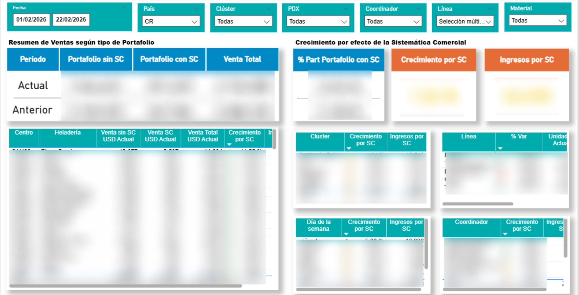
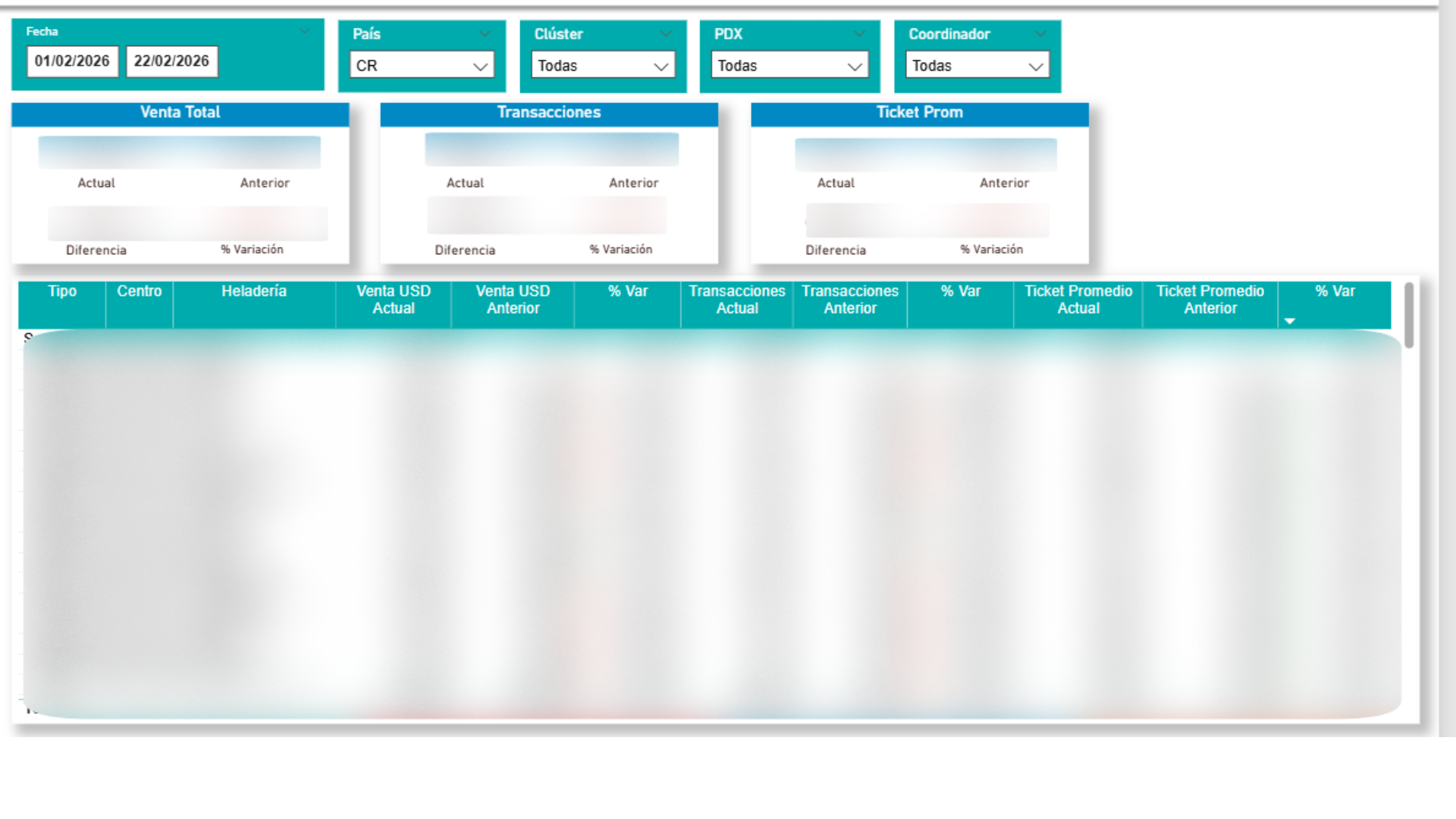
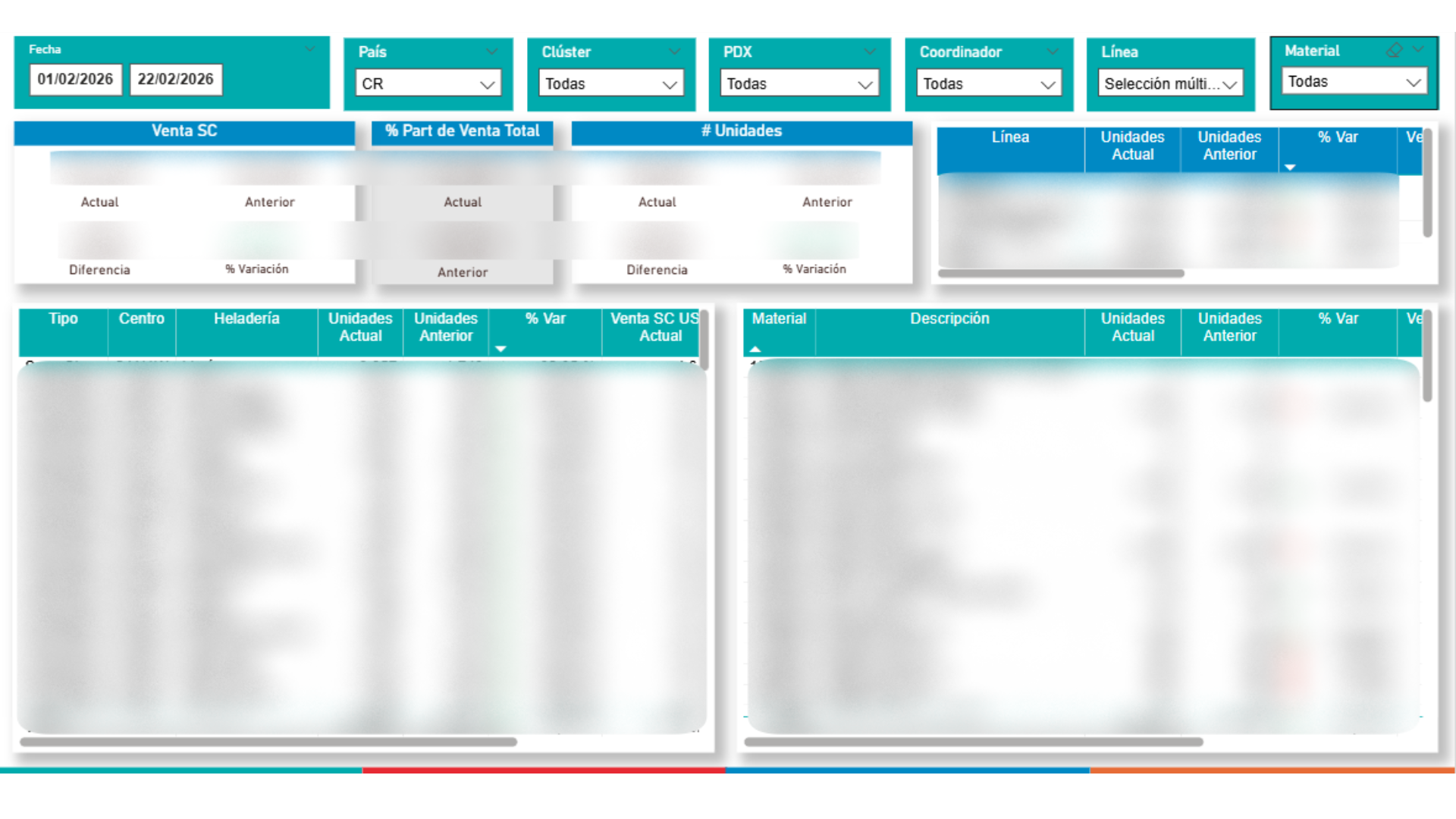
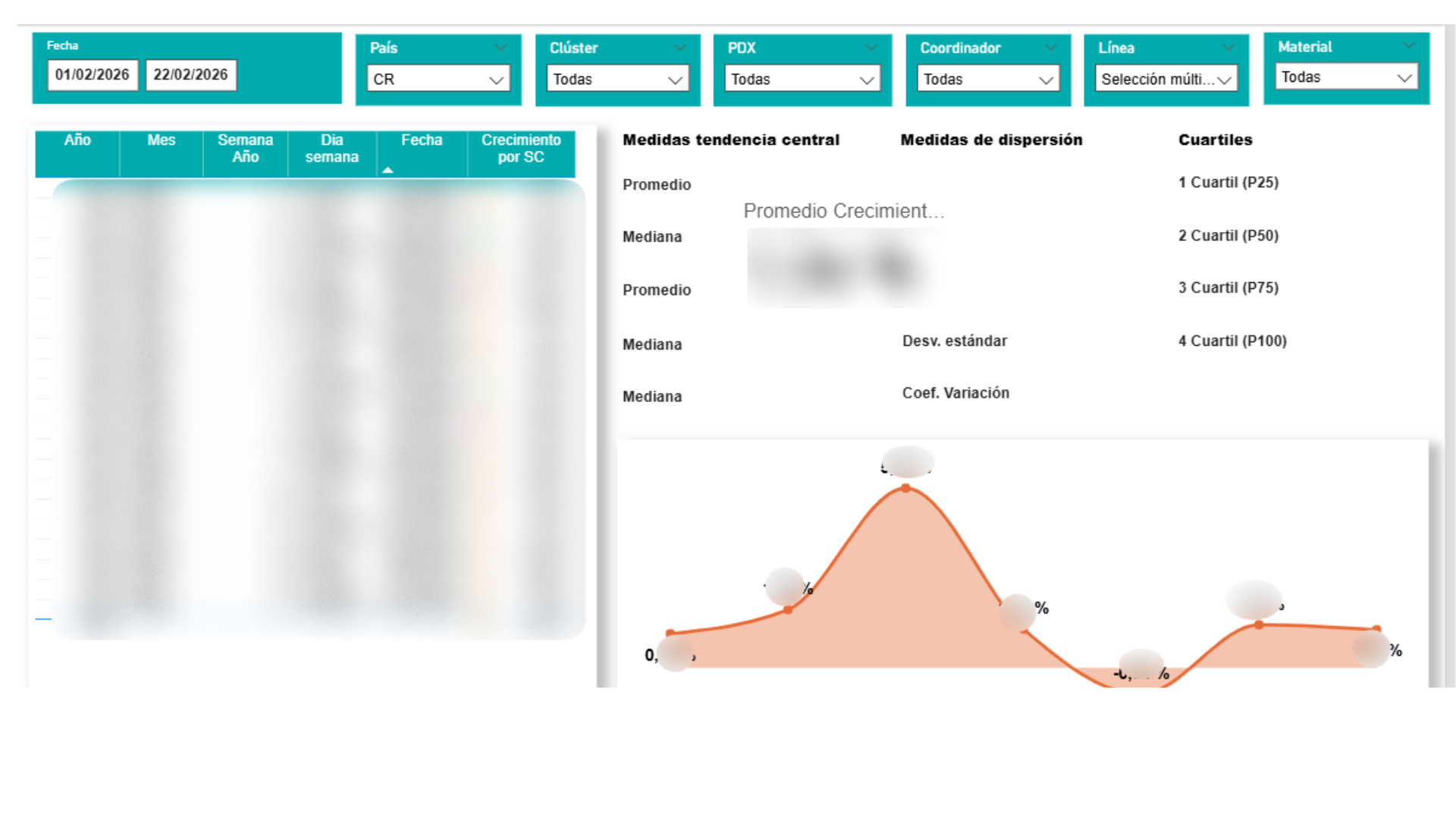
The project started with a series of meetings with key stakeholders to understand the core business question: how is the Commercial Systematic strategy impacting sales? We mapped out the KPIs that mattered most — total sales, transaction count, average ticket, growth percentages, and portfolio segmentation — and defined how each metric should be sliced by country, cluster, point of sale, coordinator, product line, and material.

Dashboard overview showing KPIs and filters
2

Data Collection

With the requirements clearly defined, the next challenge was sourcing the data. Sales transactions lived in SAP, so we built a UiPath automation to extract the necessary datasets — sales volumes, transaction records, and product catalogs. The extracted data was initially staged in Excel workbooks, providing a structured but raw foundation for the next phase.

Sales and transactions comparison view
3

Data Cleaning & Transformation

Raw data is never ready for analysis. Using Power Query inside Power BI, we cleaned and transformed the datasets — removing duplicates, standardizing product names, handling null values, and building calculated columns for metrics like growth percentage and portfolio participation. This phase ensured that every number in the final dashboard would be accurate and trustworthy.

Material-level breakdown and units analysis
4

Data Visualization

The cleaned data came to life in Power BI. We designed multiple dashboard views tailored to what stakeholders needed: a high-level executive summary comparing current vs. previous periods, a detailed sales breakdown by portfolio type, and a statistical analysis page featuring measures of central tendency, dispersion, and a distribution curve. Every visual was built to answer a specific business question, not just to look good.

Statistical analysis with distribution curve
5

Automation & Validation

A dashboard is only as good as the data behind it — and stale data is useless data. We automated the entire refresh pipeline: the semantic model in Power BI updates on a scheduled basis, ensuring stakeholders always see the latest numbers without manual intervention. Additionally, Python scripts were developed to cross-validate the Power BI outputs against the source data, guaranteeing data integrity across the entire pipeline.

Automated refresh pipeline ensuring real-time accuracy